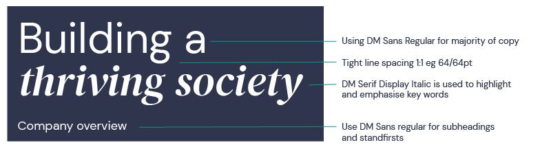
Typography

Fonts

Our primary brand typeface is DM Sans. This can be used at Regular, Medium and Bold weights to help give a clear hierarchy to information. Italic versions of these three weights are also available if needed. 
 
DM Serif Display Italic is also a primary typeface, used alongside DM Sans, to highlight key words.
 
These typefaces can be downloaded from Google Fonts here:
 
- DM Serif Display

Here is a link explaining how to add a font to your PC. 

Where a system font is needed such as in an email signature, Microsoft Word or PowerPoint, please use Arial Regular, alongside Georgia Italic, following the same design principles but substituting Arial for DM Sans and Georgia for DM Serif Display Italic.
 
 Arial with Georgia Italic
 

Usage

Headlines

Use DM Sans Regular as the primary font, in combination with DM Serif Display Italic to highlight key words.

Typography - properties-01
 
Subheadings within body copy and body copy
Use DM Sans Regular.
 
For headings within body copy, use the Medium or Bold weight. Body copy should be left-aligned and use sentence case between 10–12pt in size. For small text, such as footnotes, copy can go down to 8pt. Body copy should use our De La Rue Blue on White or Stone Grey.
 
Bullet points
Our bullet style uses dashes for external presentations, in the same colour as the text. 
- bullet 1
- bullet 2 
 
Try to avoid nesting bullet points in external content where possible. 
 
For more information on accessible colour combinations for text refer to the colour palette
Typography - properties-02
 

Labelling

We have a labelling system to signal types of communications within each division.
 
Tier 1 is the overall division label consisting of a solid colour block containing the division name in DM Sans Medium uppercase in White 20pt text.
 
Tier 2 adds the specific product or service name beneath the overall label. It is held within a keyline block written in DM Sans Medium uppercase in White 16pt text.
 
Each division should use their designated colour palette – Emerald Green for Currency and Dusky Pink for Authentication.
 
For guidance on using the labelling system in application layouts, please contact marketing@delarue.com.
 
Division labeling system

Tier 1

Top level signalling of division communication.

Typogrpahy labelling Tier 1

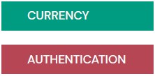
- Division name written in DM Sans Medium uppercase placed within division-specific solid colour block. 


- The size of the label blocks is based on the underlying grid used. At A4 size it is one row high and six columns wide. Please refer to the graphic system pages for guidance.

Tier 2

Product specific communication within division.

Typogrpahy labelling Tier 2

- Division name written in DM Sans Medium uppercase placed within solid block (20pt at A4 size)

- Adjoining keyline block containing name of specific divisional product or service written in DM Sans Medium uppercase (16pt at A4 size). Keyline is 1pt at A4 size proportion.

- The size of the label blocks is based on the underlying grid used, and the length of the product or service name. At A4 size it is one or two rows high and six columns wide. Please refer to the graphic system pages for guidance.


What not to do

Our chosen fonts are part of our visual assets should always be used in a clear and legible way. 
 
To keep our brand consistent and recognisable, please use DM Sans and DM Serif Display when designing externally facing work. 
 
Here is an example of what not to do with our typography.  Neither font is part of the guidelines, the logo is obscured (and distorted and placed over a patterned background). 
DLR WHN TypographyCustomer gift example